Saturday, 28 March 2015

A Walk in the Park


Post Christmas, I was a bit....meh.  I'd bust a gut getting stuff ready for galleries and shops, then more literally bust a gut 'doing' the whole festive bit, and January was a bit of an anticlimax, as it is for most people.  Although some optimistic souls I know were all full of the joys of a new year, new challenges, and a bloodstream devoid of alcohol, none of this was really catching my imagination.

Then I got an email from the Craft & Design Gallery in Leeds, one of my favourite stockists, inviting me to put a collection in to the exhibition they were planning on the subject of A Walk in the Park.  And Lo, for there was a new spring in my step, an opportunity to do something new, explore some new ideas, stress about a new deadline.

As usual I had plenty of ideas - some new, some still unexplored as I write (adventure playgrounds, the lines, the organic woodiness, the possibilities......), and some that had been in the sketchbook for years.  Something that I have learned (and relearned again and again and one day it might sink in) is that I never allow myself enough time to fully develop my designs before starting work, but I'm not sure that I ever will.  My 'design process' usually consists of brainstorming design ideas, having great ideas in the bath, and fiddling around with various pieces of etched metal I pick up in my workshop until I get something I like. (I've talked about my working processes in the Blog hop blog).


So, cue the Tony Hart music, here's what I came up with......


Magpies, an obsession for many people, I know.  I do love a corvid (Arabel's Raven is one of my favourite books ever), and they always remind me of the time I first came to Leeds, 25 years ago, when I was struck by the numbers of them that hung around in Hyde Park.  I'd never seen so many, being an impoverished Londoner.  Nowadays they hang around in my suburban garden and recently spent a long time in competition with a squirrel in trying to acquire a duster which had been hanging on my washing line for quite a long time. I'd always come across a snag when trying to design a big magpie necklace, as although I'm not superstitious you never know, do you, and I couldn't just do one magpie.  Then one of those bath inspiration moments when I realised I could do a reversible pendant, 2 magpies for the price of one (or even 3, if you want to, and boys are your thing).

Taking the colours of the park, the blue skies (?!), the green spaces, I incorporated some enamelled elements into some of the pieces.


Birds in trees watching the proceedings, or just getting on with life and survival, and landscapes, willows, dogwoods, buildings........


I'm really pleased with this last one, the only one with figures in it to make it to a finished piece.  Here I was trying to get a bit of that 'Abney & Teal' vibe of the urban park, with the tower blocks in the background.  I've been using one of my makers mark punches to make the square windows in things, which is quite clever of me, don't you think?

And finally, something which just didnt make it into the exhibition, but which I really like.  Here come the practicalities of making jewellery I've spoken about before........I had enough large neckpieces, plus I didnt want to spoil that particular composition by drilling holes in it.  (I did make another piece involving a riveted on back with holes for hanging, and some figures, but wasn't really sure about it).

It really wants to be a brooch for a coat or scarf, as the cutout piece will frame a nice fabric showing through, but a sterling brooch back would make it very expensive for a copper and brass piece, I don't like to confuse things by using base metal findings and anyway they're difficult to stick on reliably.  I attempted to make a copper brooch pin myself, which would have been ok if I had several more weeks to battle with soldering it on properly, but as this was the night before the deadline I didnt really have that option.  Anyway, it looks pretty I think and may make a good card or picture before it finds a role as a piece of jewellery.


A Walk in the Park  is at the Craft & Design Centre in Leeds (under the Art Gallery)

Wednesday, 26 November 2014

Blog Hop and Where on Earth Have I Been?????

 Oh my and heavens above etc etc is it really nearly 18 months since I last blogged?  I'm surprised the world hasn't stopped turning on its axis.

Anyway, perhaps in a subtle move to spur me on to get going again, the lovely Chrissie Freeth, handloom weaver, blogger and all-round Extraordinary Woman, has nominated me to take part in the blog hop.  You can see her post here.  And if you haven't yet checked out her work then please do - I love the rich colours of her dyed wools and the beautifully eloquent yet down to earth way she talks about her inspiration and working practices.  She does have an irrational aversion to the colour blue though, so be warned.

So, the blog hop......basically artists and makers answering the same 4 questions and nominating two further people to do the same the next week.  I accepted Chrissie's nomination because I thought it was about time I gathered my thoughts, having had my head down constantly since April, making work for the new galleries I'm stocking.  It's 2 days late, so you must forgive me.  I hate the stereotype of the scatterbrained creative type (hmmm, future subject....) as most of us are pretty organised (as you have to be to run your own business), and I'm usually glued to my organiser, but something may have come unstuck over the last few days...Apologies if it's a stream of consciousness, but 'it's been a year'*.

What am I working on?

As I mentioned above, I've been very production-orientated for the last few months, since getting some interest from galleries at the British Craft Trade Fair in April.  So invention has gone to the wall rather in favour of producing stock designs which I know I can make in a reasonably profitable way, and are popular - my bread and butter.  However, I'm unable to resist playing around with shapes and colours so, for example, my Lunar range, which started with 9 designs (which fitted nicely in a 3x3 square in my brochure) now has 19 items in it.  


The Craft & Design Gallery in Leeds had spotted my metallic pictures on my website and asked for some of them for their Christmas exhibition, 'which was nice'** This was very flattering, as they weren't something I'd really gone out of my way to market - they tend to just evolve and I regard making them almost as a luxury. It did make me knuckle down to produce some finished framed versions which I was really pleased with.  They are the logical conclusion to the work I've been doing combining jewellery and printmaking techniques and I plan to develop these further 'when I get the chance'***, perhaps with some more photographic elements incorporated into them.


How does my work differ from others of its genre?

My Mum's always saying she likes shiny jewellery, and mine is definitely not shinyI recently helped out at a pop-up shop where my work was on display, and it was most illuminating to hear peoples' comments about my work when they didn't realise the maker was listening in.  Thankfully, most of the comments (and one I get often to my face) was that my work was unlike anything else you tend to see around, but there was also some puzzlement as to the nature of the metal it's made out of.  A lot of people tend to think it's pewter, which I don't really mind as I love pewter, but I think that contributes towards the darkness and subtlety of some of the colours & textures, contrasted with a bit of shiny-shiny. 


There's quite a painterly aspect to some of my work, both in the abstract landscapes and the enamelled pieces, which isnt surprising given the printmaking I suppose.  The fact that I love to work on a flat plane contributes to this too - I'm working towards making this even more of a feature and defining my pictorial style a bit more.  There's so much more to be done!


Why do I do what I do?

Ever since I used to frequent Camden Market in my teens, I've wanted to be a jeweller.  I wanted to be one of those cool people who lived on a barge with dreadlocks and ate felafel with fingerless gloves.  Now I think it would be a bit too cold, but I still love what I do.  I love the fact that if I fancy making something, I can make it, and then as an added bonus which I still don't quite believe, people actually like it.

When I did a painting and drawing evening class we dabbled in printmaking and straight away my tutor said I was a printmaker (maybe that was a tactful way of telling me I wasn't a painter or drawer but I liked the sound of it).  In jewellery-making, no matter how spontaneous you try to be, you're constrained to some extent by the fact that you're making something which has to be worn on the body, not fall to bits or fall off, or be uncomfortable, and will make the person wearing it feel good.  It's been a subject of some debate in my circles, but I remain to be convinced by some creations that are beloved of the Crafts Council world but fail in my books to qualify as jewellery...anyway, back to the point......yes, printmaking is far less limited by these factors, and the joy (and sometimes pain) of peeling back the paper to see what has printed will never leave me.

Experimental monoprints

The unpredictability of the processes I use, combined with the possibilities, and combination of possibilities, and sticking one possibility on top of another and then cutting it out and sticking it somewhere else, are sources of endless inspiration.  I try to translate this as much as possible into the jewellery, to the extent that when I put together a new landscape piece, I always have to take a photo as I can't believe my luck and that I'll ever be able to replicate it. 

Metal Landscape Picture
 How does my process work? 

Somewhat haphazardly.  I very rarely now sketch out a design unless it's for a commission to give the client some idea of what I'm thinking of, though I gaze in wonder & envy at the beautiful sketchbooks of my friends.  It's more a case of fitting together a jigsaw of bits and pieces I like the look of as I go along.  I do make notes of enamel colours I've used, as they can change so much during the firing it's impossible to tell in retrospect.  

Drypoint on an etching plate
The starting point is etching the metal using traditional printmaking resisit & techniques to control the access of the acid to the metal.  This could include brushing the resist, stencilling, scratching into it, masking off.  I often do this in large expanses which are then cut down as I find trying to limit myself to a certain size cramps & contains the movement of the lines and textures.  I then cut out shapes to overlay onto other shapes, whatever seems to work.  Quite often there'll be a happy accident where I just put something down on top of something else in the workshop and it looks great.  Then it's soldered together, selectively polished to acheive aforementioned contrast, and finally patinated with a stinky old mixture of liver of sulphur and ammonia.  Sadly, although this produces astonishingly beautiful colours of sepia and turquoise, they don't last when lacquered to protect it, though some little protected areas tend to shine through. The general effect is to add dark areas in further contrast to the shiny bits.

A Happy Accident

I use so many processes in printmaking that to describe it would take far too long, so have concentrated on the jewellery, but the same haphazard approach applies. (If interested in some of the printmaking techniques see previous blogs). 

So them's my questions - I have nominated Naomi Southon of nimanoma's blog.  I think we have a similar approach in terms of using art pieces as inspiration for, and basis of, jewellery. Naomi has a far more scientific approach through her background in biology, and an endless fascination with the minutiae of nature which results in the most stunningly detailed and coloured pieces.

My other nominee is an as yet unnanounced surprise....


*    Time Gentleman Please 2000-2002
**   The Fast Show, 1994-2000
***  Any craftsperson or artist, ever.

Tuesday, 11 June 2013

Just some pictures from the course I recently did at West Yorkshire Print Workshop with the marvellous Neil Anderson.

Apart from getting stuck on the M62 for 5 hours after the course one Friday, it all went really well, with a great balance of structure and flexibility.  I felt I learnt a lot of new stuff, as well as improving and expanding on techniques I was already using.  I've done lots of courses and workshops there and they've all been great - I'd thoroughly recommend checking it out!


Week one - messing around with monoprints.  


Week 2 - etching basic lines and selective ink wiping


Week 3 - Developing the print with inking over the etching, adding monoprinted textures and chine colle (collage).

 
Week 4 - developing the etched plate with sugarlift technique


Week 5 - On hols in sunny Norfolk.  The others did screen printing.


Week 6 - Etched a new plate, inked and did a bit of experimenting.

Still lots that can be done with this, but pleased I had the discipline for once not to put too much information in!

Detail

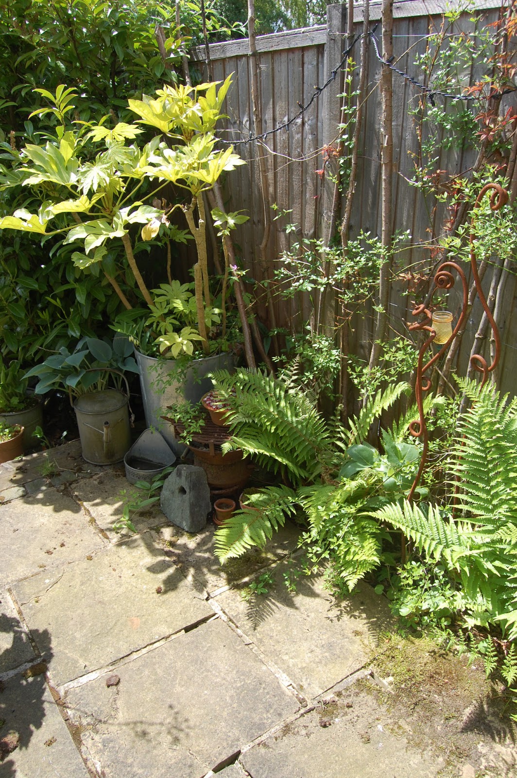
 And now, a couple of photos of my garden looking rather lovely (even if I do say so myself) in our brief sunny spell


Toodle Pip xxxxx

Friday, 19 April 2013

Ta da!

A quick return to the printing dungeon today, to see whether it would be possible to add silver leaf to my print.  I was dubious about this, as previous efforts with chine colle have not been entirely happy, and silver leaf is, to put it mildly, a bugger for flying off and sticking to the wrong thing.

Anyway, I consulted a great book I've got, by the marvellous printmaker Brenda Harthill
Of course she made it all sound far too easy but I thought it was worth a try, and here are the results (with aplogies if it's difficult to see in the photo - I did my best!).


The first, and I think my favourite, attempt.  In case you can't tell the difference (!) this has a semi-circular shape of silver


Trying with a circular silver shape but some of it peeled off.  Still quite a nice effect


More of a crescent shape.  I think some glue must have squidged out at the top, hence the smudge.  Annoying.


Anyway, I really am pleased with how these have turned out (I must point out that the registration and other printing of these is really not bad, and I've managed not to get any massive fingerprints on them, which is a huge achievement in itself by my standards).

Many thanks again to Cath for lending me her workshop, and to everyone who's encouraged me in this endeavour (and now they're playing the exit music so that's my cue to leave....xxx)

Wednesday, 17 April 2013

The terrible truth.........

So, time to disappear into the subterranean world of my mate's print studio and see whether the plates I've made will produce anything like a decent print.

My box of tricks

First, I get out the inks I'll be using. I'm not quite sure of the colours I'm going to be using yet - have a vague idea about blues and browns, but also a feeling I'll end up with yellows and greens as I always gravitate towards these.


Having mixed up some colours, decide they are pretty horrible - that pale blueghh is probably one of the worst colours I've ever seen.....


I tend to use brushes to 'paint' the ink onto the plate, pushing it into all the crevices.  
By this time, as you can see, I've given up on the blue idea completely and have yellow/green/blue variations and blue/grey sky.


I use 'scrim' (loosely woven cloth), then tissue paper to take the excess ink off, and the plate's ready for printing.


Something I did earlier - drew around the plate onto some acetate on the bed of the press, so I can position each plate in the same place (in theory, easier said than done, as will be seen later).

The plate on the press ready for printing 


The paper is then placed on top of the plate and rolled through the press.  I tend to do it once in each direction just to make sure! I also try to catch the paper under the blanket so it stays in the same place for printing of the second plate on top.


Unfortunately I fail in this task, so have to do a bit of guesswork in repositioning it before printing the etched plate.  Well, it is a test piece, after all....

Now for the etched plate....


I've used an old credit card to cover the surface of the plate with ink, and then scrape the excess off.  This is then followed by scrim and tissue, as with the collagraph plate.  I've used some sepia coloured etching ink as I want this layer to be all one colour over the top of the multicoloured collagraph. 

The plate is then positioned on the press, using the outline to 'register' the image with the previous one.

Tada!

And here's the print.  This is the first time I've seen how all the marks will work, especially in relation to each other from the two plates and I'm pretty pleased.  You can see in the bottom corner how the registration is out, as the paper came out of the press by accident in between pressings.  And my decision to add the pva bit at the bottom was vindicated! The etched elements are a bit more feint than I would have liked, and this may be down to my having taken too much ink off the plate.

I made a few notes about things I could change on the plates, or subsequent prints.

Illegible scrawl - more colour variation, more PVA for horizon, more lines on moon?


I quite like the subtle colours of this print, but today is about experimentation and a pot of violet ink on Cath's shelf catches my eye.........

Woohoo!  The collagraph plate before wiping - definitely more colour variation here!


I really like this version too - the etched elements have worked a lot better as I wiped the plate a bit less so there's more ink left in the indentations to come out on the print. 

Out of interest at this point I tried printing just the etched plate to see how it looked. Really I suppose I should have done this beforehand but it was all too exciting.


So there it is.  As I feared, there's a bit too much contrast in the sky for my liking, but, in conjunction with the subtler marks in the collagraph it seems to work better. 

I printed a few more versions, on different papers and with varying success.  It's amazing how many different things can go wrong with a print - never, of course, all on the same one, so I have problems with registration with a couple, and a really annoying smudge from inky fingers on what would otherwise be a perfect print.

Colours a bit more subtle - or muddy?

Dodgy registration

The product of 3 hours work

 So, then the inevitable clearing up, and the legacy of indelibly grubby fingers for the next few days.


 Tomorrow I'm having a coffee break with some crafty colleagues, and I'll have a really good look at the prints again, and think about any improvements which can be made.  I also need to give some thought to my ambition to get some silver leaf on the moon.  This is going to be A Technical Problem as it needs to go underneath the other images......thought and research is required!

So, back underground on Friday, which will hopefully result in some saleable prints - time will, again, tell.